


Additive and Subtractive Colour, RGB and CMYK
👇 Get new sketches each week
Making colours by mixing light vs mixing paint
I learned about mixing colours from my art teachers at school. Primary colours, secondary colours, complementary colours and if you mix them all together you get a rather dark, brown mess.
So I have always been intrigued by how mixing colours of light seemed to do the opposite. You mix red, green and blue lights and you don’t get a dark brown, but instead bright white. What’s going on?
Additive and Subtractive Colour
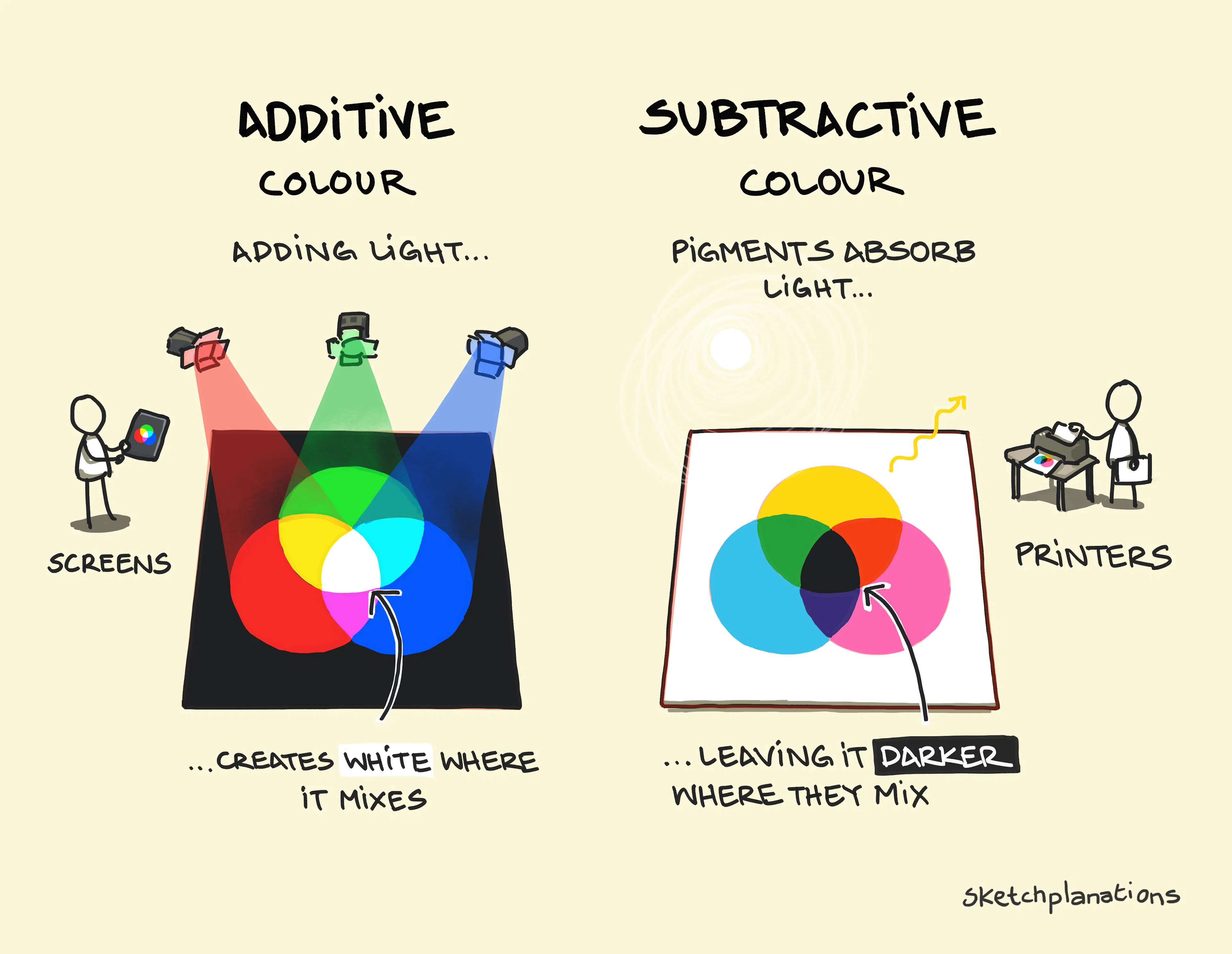
Coloured lights behave differently from the pigments in my paints; they mix additively.
White light, like sunlight, contains a broad range of wavelengths. You can see this when a prism splits light into different parts of the spectrum, or when raindrops produce a rainbow. But we can also perceive white by mixing red, green and blue light. Adding each light in the right proportions brings it closer to white.
The pigments in my paints, on the other hand, behave differently.
When I put yellow paint on a surface, it absorbs much of the blue light falling on it, and the remaining reflected light we perceive as yellow. The pigments subtract parts of the light spectrum. As I mix different pigments, they absorb more of the incoming light, generally making the mixture darker. For black objects, very little light is reflected back to our eyes.
Screens work with light and additive colour. They tend to use RGB—red, green and blue—lights, which when shining together can produce white and when off, get close to black.
Printing on the other hand works with inks and subtractive colour. They tend to work with CMYK—cyan, magenta, yellow and black. Cyan absorbs mostly red light, magenta absorbs mostly green light, and yellow absorbs mostly blue light. By absorbing light from different parts of the spectrum, they are able to produce a wide range of colours. Because using cyan, magenta and yellow together doesn’t quite make black, a separate black ink is usually used as well.
I was confused by this, because I think of the traditional painters' primary colours as red, yellow and blue—after all, mixing yellow and blue makes green. But CMY can actually produce a wider range of colours because each pigment absorbs a different part of the light spectrum.
Why do screens use RGB?
Again, I wondered: if primary colours are red, yellow and blue, why do we use red, green and blue lights for displays? It turns out our eyes have three types of colour-sensitive cones, each sensitive to different, overlapping parts of the spectrum. Red, green and blue light are particularly useful for stimulating them in different combinations. I wonder what the evolutionary root of that was—spotting the fruit in the trees?
So red, green and blue happen to work very well for human vision. Dogs have two types of light-sensitive cones. They see blue and yellow but are colour-blind between red and green. Yet, many birds have four types, with some birds sensitive to ultraviolet light. So perhaps a screen designed to mimic what birds can see might need four primary lights, including ultraviolet, instead of the three RGB we have for humans.
How RGB and CMY are connected
If you look closely at the sketch, there’s an intriguing symmetry to spot.
Additive colour (light)
- Red + Green = Yellow (always surprising to me)
- Green + Blue = Cyan
- Blue + Red = Magenta
Where the three RGB lights overlap, they produce the CMY colours used in subtractive colour mixing.
Subtractive colour (pigment)
Each pigment absorbs part of the incoming light (broadly speaking):
- Cyan absorbs red (leaving green and blue)
- Magenta absorbs green (leaving red and blue)
- Yellow absorbs blue (leaving red and green)
So when you mix two pigments:
- Cyan + Yellow = removes red + blue = Green remains
- Cyan + Magenta = removes red + removes green = Blue remains
- Yellow + Magenta = removes blue + removes green = Red remains
The secondary colours of additive mixing are the primary colours of subtractive mixing, and vice versa.
Adding light makes white.
Absorbing light makes dark.
Related Ideas to Additive and Subtractive Colour
Also see:
- The colour wheel
- Atmospheric perspective
- Blending buildings
- 60-30-10 colour rule
- Autumn leaves and the compounds that cause their colours
- Plutchiks’ wheel of emotions
- The Stroop Test
- The Olympic Flag
Prefer color to colour? I made a US English version of additive and subtractive color for you.
I draw and write about what intrigues and interests me, but I’m not a vision scientist. Please send corrections and advice my way!